Posts

Showing posts with the label logo design

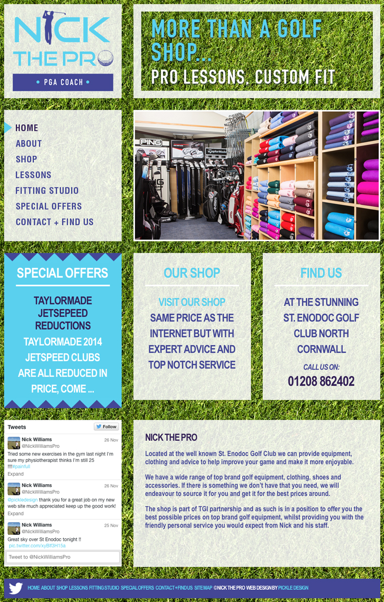
Design for Nick the Pro
Image
Quite often the websites I design are minimal, controlled and use white space rather lavishly. However sometimes a project calls for something a little more bold. When I was designing this website for Nick The Pro, I decided to go for bright. Nick has the golf shop at the beautifully located St Enodoc golf course in Cornwall. We started by designing Nick a logo and then some stationery and finally this website. Nick stocks the best gear for golf but at really competitive prices. He also offers pro lessons and a great fitting service - quite a lot to communicate in a design! I wanted this website to grab your attention from the outset so I went for a vibrant green background, the monitor is filled with grass and then I used chunky boxes to display the content which scrolls while the background is fixed. We have an image animation and feature boxes showing the latest special offers on the Home page. The site also has a Twitter feed and a custom designed map showing their location...

Branding for Samphire

Image
A new and exciting project for us is Samphire, a luxury chef prepared food service delivered to your door frozen or chilled. Serving the Rock, North Cornwall area this great brand is perfect for lazy evenings in, special occasions or holiday makers.  Our clients approached us with a clear vision, the name Samphire refers to the delicious plants grown by the sea, really good for you and really yummy. I used the fresh green and the paired it with black for a seal-like logo that speaks of quality and has a hand made, artisan aesthetic. We then carried this hand made feel through to the website using textures and illustration to further communicate the delicious chef prepared food. The website features a blog incorporated on the Home page where the posts alternate and show the latest from the kitchen.

Branding, Print and Website Design for BeauPeople

Image
I wanted to share a recent brand we completed, BeauPeople. Our client approached as at the very start of her new business in workforce development. She needed a corporate and professional identity which showed she meant business, but still reflected her bubbly personality and approachability. We designed a logo in warm autumn hues with harmonising imagery. One of our client's great assets is her ability to bring unity and conflict resolution to the work place, so we looked at ideas of building bridges, Japanese design and elements of balance. The final logo communicates the harmony our client can bring to a situation, the 'beau' and 'people' acting also like a reflection. When it came to designing the business card I continued to use the two colours of her brand, and bold clear placement of the logo. I felt that some explanation was needed, so a friendly speech bubble helps to communicate the personal side of the service. Next we concentrated on...

Logo Design for Time and Tide

Image
This is the logo that we created for media company Time and Tide. The client was looking for a simple mark that would be as striking as a small label on a piece of equipment along with holding its own on film credits. Time and Tide wanted the mark to work in simple black and whites and have an element of tongue in cheek. We discussed many different and disparate directions: sailors tattoos and other nautical themes, coats of arms, and the work Keith Haring and Stussy. We kept the line thick and bold, as if it had been drawn by a marker pen, ensuring it was not over worked, and this gave us a finished result that works well black on white, or reversed.

Logo Design for Organic Restaurant and B&B

Image
We recently completed a logo design for the Bangors Organic Restaurant and Accommodation. The business is located past Camelford in North Cornwall, and has many outlets for their organic ethos. They offer bed and breakfast, a restaurant, homegrown produce and homemade products. The house itself is a beautiful example of the Arts and Crafts movement and we wanted to let this show through in our designs. We were asked to design a logo and a business card, and I was inspired by their apple tree which they felt characterized them. It is full of personality - not perfectly strait but natural and quirky - so I drew a stylised version of the tree and chose a striking green, black and cream colour scheme to make the logo stand out. The name 'Bangors Organic' was chosen without a tag line to give them freedom with which avenues they choose. The type selected simply links the two words by their letters to become part of the tree illustration. I also provided a logo which was more leg...

New Branding for Cornish Fudge Company

Image
Buttermilk Shop wanted a fresh contemporary look for their Cornish fudge company, but essential in the brief was ensuring that their primary market was not alienated during the change. This is a challenge we face with many projects, as the years spent building up a customer base are not to be taken lightly. We came up with a clean typographic solution which could be placed onto different colours to reflect different flavours on the packaging. This is accompanied by a small line drawing, reflecting the Cornish coastline. The vector image is key to the connection between old and new, a crisp modern style of illustration representing the long tradition of Cornish fishing ports where the Buttermilk shops are located.

Riding Out the Recession

Image
We have just completed work on the new identity of Riding Out The Recession, a fund raising bike ride from Cornwall to Cape Town by Sean Maher. Marie has been working on the project, and wrote the following about the process so far: “Sean came to us to see if we could help him with branding and a website for his bike expedition. We thought his plan to 'ride out the recession' was a great idea and wanted to help so he can get the maximum support for his charities. We started by creating a logo for him, looking for something that tells the story of his journey. We choose a hand-drawn style that reflects a personal feel, whilst the colours suggest the action and adventure of his quest. We are looking forward to keeping up with Sean's progress as we work on other elements of the project, such as his website, which will feature a blog and image gallery so everyone can keep up to date with his latest movements. We are very excited to be involved, and hope Sean will raise lots of ...