Posts

Showing posts from 2011

The New Pickle Baby!

Image
A good way to end the year at Pickle Design with a new addition! Rufus was born at 5.09am on the 23rd of December and is now at home with his mum and big brother Henry! Carl and Maria would like to say thank you to everyone who wished us well on the nervous week before he was born, and also to all who have been in touch since.

Picaloulou's Hand-Knitted British Children's Clothing

Image
We have just completed a very exciting project for brand new company, Picaloulou, a web-based business selling beautiful hand-knitted woollen clothes for children. These are the highest quality and completely British. Our task was to design a website that would communicate the integrity and beauty of the brand, and feature an easy to use online shop. We worked on the look allowing plenty of white space for the stunning photographs, with a colour scheme of muted greys. The brightness comes from the woollen garments themselves and the vibrant logo. The home page has fading images using handwriting to create an informal feel. There are also feature boxes that connect straight through to key pages. The Facebook and Twitter logos have been custom designed, in-keeping with the rest of the site, and we have used little elements of illustration to bring a child-like feel. As well as designing the pages for the shop, all restrained and clear, we have created the concept for the b

Cafe Menus Full of Illustration

Image
We have just completed new menus for the Wadebridge coffee shop, Caraways. They approached us to re-design their menus to reflect the feel of their friendly cafe. We kept within their colour scheme of coffee browns, caramels and creams, but added a dusky sky blue. I chose a friendly serif font and filled the pages with my drawings of coffee cups and cakes, sandwiches and salad. The menu took the format of A5 folded with a durable matt finish. The front page has an illustration of a large cup of steaming hot coffee, with a dotty frame surrounded by a crisp white background. Inside the format has titles, descriptions and prices separated by dotted lines and distinguished by colour and weight. The menu is such an important part of a cafe and we are pleased that Caraways now has something representing them in a fun and relaxed manner.

Granny Wobbly's Fudge Pantry Website

Image
Recently we completed an e-commerce website for Granny Wobbly's fudge. They already run two cute and quirky fudge shops in Wadebridge and Tintagel, Cornwall, but wanted to expand their shop online. The clients already had a logo and we needed to convey the feel of the shops themselves on the website. So we designed a simple but fun website, complete with blog and full e-commerce facilities. We used pink dotty and stripy bunting to frame the site and a swirly background allowing the text to be clear on a white page. The blog appears on the right hand side of the home page like a blackboard and there is a section for the client to update with their seasonal promotions. The shop admin allows the clients to upload the products themselves and edit the categories, and the shopping cart was designed to fit into the website style. The intention is for the shop to be very easy to use, encouraging sales. One of the best things about the project was tasting their ever changing var

The Artist, Joanna Commings', Online Gallery

Image
We have recently completed a website for talented Cornish-based artist, Joanna Commings. She approached us as she needed an online presence and a way to showcase her portfolio. I love designing artist's websites, as the idea is to make the design minimal and allow their work to speak for itself. I chose one of her iconic paintings as a banner and used the navigation to create depth, light and shade. Then created a format allowing a large image and thumbnail shot on each page, with a pallet of grays and white to complement Joanna's Cornish art. The home page has an editable section where Joanna can keep people informed about up and coming exhibitions, along with a little information about the artist herself. There is a page focussed on her landscape paintings and a page about her portraits and commissions. We also created an online gallery so that Joanna could upload her paintings herself. This allows her beautiful pictures to be displayed large and to be navigated w

New Website for Lola Smith's Handmade Children’s Clothing

Image
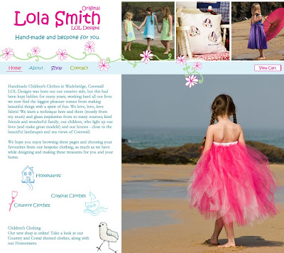
We would like to introduce you to Lola Smith, a very unique business. This is the new website we have designed, complete with an e-commerce shop for Lola Smith's handmade and bespoke clothing. Lola Smith creates clothes and homewares to your exact requirements, so we set about creating a website that reflected their original handmade styles and girly aesthetic. We used illustration and fading images to make the most of their lovely photography. We set the site on a background of pale blue and white dots and used little illustrations for navigation buttons, such as the social media sites Facebook and Twitter. Lola Smith's handmade children’s clothing is available from their website, but uniquely, each item is made to order. This means that the clothes are to your child's measurements, and gives you the opportunity to have something created to your tastes. The whole website uses pastel and girly colours, but we left the body of the page white to best showcase their

Just Fab's New Website

Image
We have just finished an exciting new website for our clients Just Fab, a Launceston based interior furnishings company with the largest collection of fabric samples in the Westcountry. Initially we re-designed their existing logo and created some bold, bright signs for their showroom, then our rebranding work took in their stationery, adverts and finally, website. The first step was to carry out a photoshoot. The concept was to follow the process a client could go through as well as showing the vast amount of material Just Fab house, along with the quality of their upholstery and curtain making. We then used these photographs in numerous applications such as exhibition signage and advertising, before applying it to the website. This photography is used extensively to recreate the atmosphere of their large showroom, an Aladdin's cave of textures and colours. The new site needed to reflect the brand, so we incorporated the two blues from their brand and the abstract fabric pa

Promotional Badges Can Still Be Fun!

Image
One of our clients, Absolute Joinery, recently exhibited at The Cornwall Home Show held at Kingsley Village. They approached us asking for some promotional material to give out to prospective clients. They had previously remarked on our own badges , which we had produced to work alongside our 2009 calendar, and were looking for something just as fun and quirky. So we set about working on two designs around the theme of wood and bespoke design. On one badge was simply written in a cartoon-like font "I Love Wood" in brown tones, and the other featured a collection of furniture in white on a background of wood grain. The limited size is always a challenge but there is something irresistible about designing badges, they have an indie-cool and are very collectable - everyone likes something they can pick up and take away for free. The company's web address was included so people would remember where the badges came from. Absolute pride themselves in producing work that s

Photographs and Typography by Jess

Image
These last two weeks we have been enjoying the company of Jess who is with on a work experience placement. Emma set her a project that took advantage of her creative skills and new techniques she has been learning in the studio. Here is what Jess has to say about the project. “My brief was to take photographs around the garden and then add some appropriate quotes on to them. I also decided to add a few illustrations on to some of the images. I added filters using Photoshop to make parts of the images stand out such as the red chair. Red Chair (Top) “I took this image from a low angle to make the small chair look large and powerful. I then dulled down the background to make the redness of the chair stand out more. For the illustration, I decided to draw a very small man sat on top of the chair, with a crown, as if he had conquered it. I thought the quote “nothing is impossible, the word itself says ‘I’m possible’” fitted with image as with the size of the person, it would seem tha

Art and Egyptian Revolution

Image
Part of Khaled Hafez's Tomb Sonata in Three Military Movements (and Overture). Photograph: Khaled Hafez Source: The Guardian The Guardian's piece on the art of the recent revolution in Egypt caught our attention this morning, especially as we were all concerned during those fraught weeks for the artist John O'Carroll who was in the country. The Guardian is running a very interesting piece on an exhibition being held from the 6th July at the Mica Gallery, Shubbak: A Window on Contemporary Arab Culture , presented by the mayor of London and encompassing all the arts, until 24th July. During this time, John was unreachable by any means, so we were very happy to finally hear from him when the dust settled. His work in Egypt takes him deep into the desert where he catalogues finds on archaeological digs. Two of his drawings are below. This work translates into his art in many ways. One of his new pieces is below. John had plenty of tales to recount when he visited

Shaw Van Conversions Updated Website

Image
An existing client, Shaw Van Conversions, came to us to update their website. They were happy with the general look we had given them but wanted to add new features and bring their website more up to date. So keeping the existing colour scheme, we set to work on the site. As the company converts vans and trailers into refrigerated vehicles, we added a snowflake background to paint the picture. Also on the home page there a section called 'Van of the Month' where the database we built calls an item from their chiller vans for sale, this is completely editable by the client. The home page really acts as a spring board to the other pages, with buttons for the van and trailer pages, as well as links to complete an enquiry form. The idea was to keep the site very user friendly but make it bright and interactive. We also created pages where people can view the vehicles available. This is also designed so the client can upload pictures without always contacting us. This re-des

Logo Design for Time and Tide

Image
This is the logo that we created for media company Time and Tide. The client was looking for a simple mark that would be as striking as a small label on a piece of equipment along with holding its own on film credits. Time and Tide wanted the mark to work in simple black and whites and have an element of tongue in cheek. We discussed many different and disparate directions: sailors tattoos and other nautical themes, coats of arms, and the work Keith Haring and Stussy. We kept the line thick and bold, as if it had been drawn by a marker pen, ensuring it was not over worked, and this gave us a finished result that works well black on white, or reversed.

Nella Marin's Unorthodox Business Card

Image
We have designed a business card for actress Nella Marin, pictured here. It has been a very considered project with us, Nella and her friend (and also our client) artist John O'Carroll, who created the swirl artwork and a 'NM' as Nella's initials. Nella didn't want a standard business card and approached us to design her something that fit her personality and profession. She wanted it to take the viewer on a journey, and make sure they really have to work to find her details! She hasn't included her profession, so in someways this business card asks more questions then it answers. This air of mystery was exactly what she wanted. We worked with high quality local printers and used GS Smith paper which has a lovely cloth like texture in 'Pristine White', allowing the uncoated paper to contrast with the aubergine ink. The card has a fold giving interactivity and her contact details are presented in the arc of John's swoosh. The letters are organic

Absolute Joinery Website

Image
We have recently finished a website for our clients Absolute Joinery. Absolute Joinery are a South West based joinery company producing beautiful bespoke joinery, ranging from one-off pieces such as staircases and furniture, to antique replica windows and cutting-edge glass extensions. We had a colour palette the client was happy with so went about creating the site. The website combines elements from both Marie and my designs, and incorporates a bespoke gallery. We used lots of photographs throughout the website to show the very extensive range of joinery the company produce, and let those images show the quality of work. The Projects page is what we refer to as a gallery and in this instance has been organised into albums of categories, such as doors or windows. This was Marie's design and I think creates an elegant platform from which the user can view the work. It was important to the client that the variety of their work could be displayed. When an album is selected a la

North Cornwall Cleaning Service Website

Image
We have designed a simple three page website for cleaning and property maintenance company; North Coast Cleaning. We wanted to communicate the range of services on offer from domestic house cleans to grounds maintenance. A pallet of fresh blues and white were used, keeping the site easy to navigate. We needed to communicate what cleaning services in Cornwall are provided and how people could get in touch, presenting this information in a friendly and professional manner.

Wood Craft Website

Image
We have just completed this three page website for Stable Wood Craft. Sarah came to us needing a new website to promote her beautiful, bespoke furniture, which she cleverly creates. These pieces are either replicas of something old or a bespoke addition to the home with shelves, wardrobes and beds all part of her portfolio. "Sarah had a logo already in place, so I recreated it as a vector image and altered the colours to suit a muted colour scheme centred around sage green. I wanted the design to be classic and speak of craftsmanship and so allow the furniture to be the focus. The logo is set centrally in the banner, and I used swirling shapes to echo wood carving detail. As Sarah did not want a gallery as yet for her furniture the pictures area displayed in the style of a glossy magazine spread." Emma Julian