Posts

Showing posts with the label websites

Design for Nick the Pro
Image
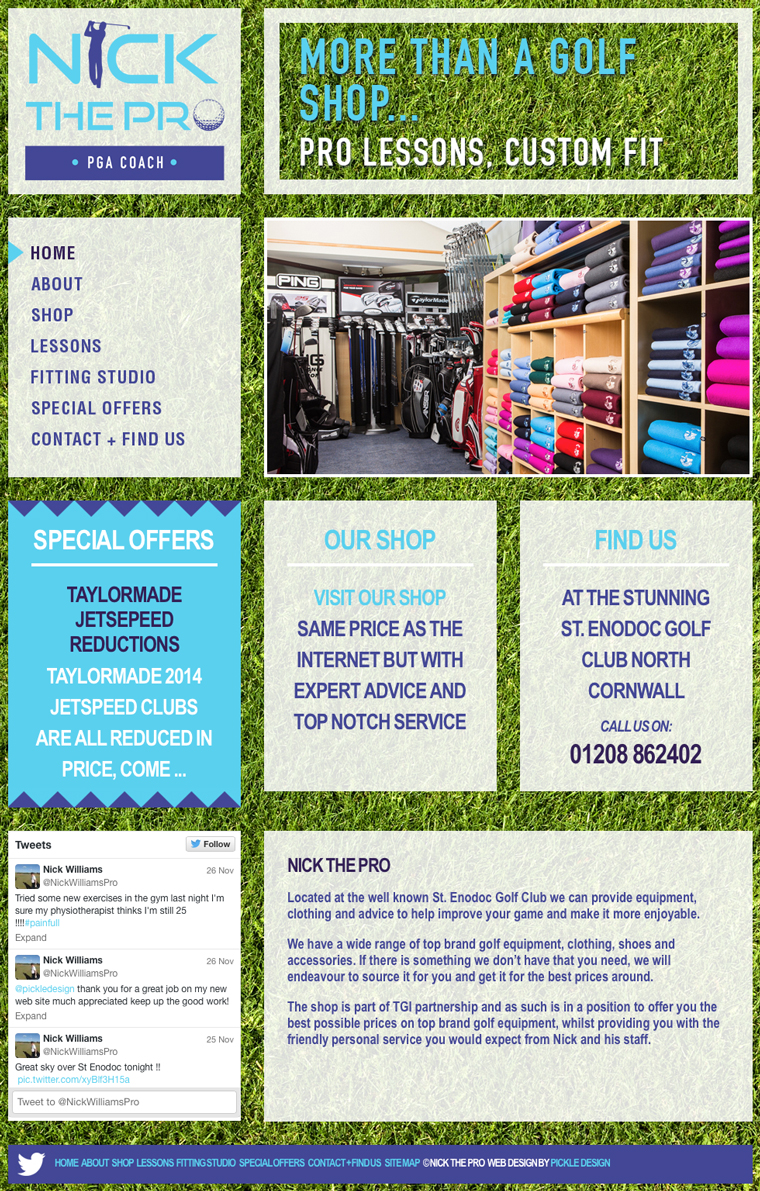
Quite often the websites I design are minimal, controlled and use white space rather lavishly. However sometimes a project calls for something a little more bold. When I was designing this website for Nick The Pro, I decided to go for bright. Nick has the golf shop at the beautifully located St Enodoc golf course in Cornwall. We started by designing Nick a logo and then some stationery and finally this website. Nick stocks the best gear for golf but at really competitive prices. He also offers pro lessons and a great fitting service - quite a lot to communicate in a design! I wanted this website to grab your attention from the outset so I went for a vibrant green background, the monitor is filled with grass and then I used chunky boxes to display the content which scrolls while the background is fixed. We have an image animation and feature boxes showing the latest special offers on the Home page. The site also has a Twitter feed and a custom designed map showing their location...

Trail Bike Hire Website Redesign

Image
We have had some great websites come into being recently - and we thought we would show you one of our latest, Trail Bike Hire. If you live in or have visited North Cornwall then no doubt you have heard of the Camel Trail. When I holidayed in Wadebridge as a child I was convinced that camels were involved, but sadly no, the camel reference is to the River and not to a Moroccan caravan. The trail itself takes the route of an old railway track and runs through some very scenic landscape. The route is mainly flat and travels through Padstow, Wadebridge, Bodmin and Wenfordbridge. Trail Bike Hire supply bikes from their Padstow base for the Camel Trail. Our brief was to create an informative and easy to use website. I wanted the design to be fresh and modern and to capitalise on the current trend for everything bike. Some elements from their existing brand were also used, such as the lovely Gill Sans font (featured in June’s Design Classic: Penguin Books ) which evokes the railway c...

New website for Trewithen Restaurant

Image
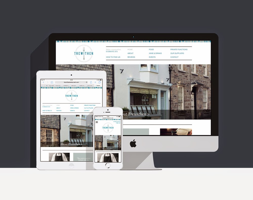
This is one of our latest websites to go live and it is for a truly delicious restaurant in Lostwithiel, Cornwall,  Trewithen . We started with the brand, creating a logo, and some elements of illustration, menu backs, business cards and bill holders. Then we came to the website. Trewithen is the perfect balance of first class food with a friendly and personal service. The brand and website needed to reflect their quality, but also the approachable nature of the restaurant. To add to the brand, I drew a selection of forks showing the range of their fine dining, and we settled on a colour palette of silver grey and teal blue. The brand also picks up on the circle shape of a plate which we used throughout.  With the brand in place the next stage was the website. This site is responsive so it will change to fit the format of the device it is viewed on, be that monitor, tablet or mobile. The website is beautiful designed to show off the lovely photog...

Website Design for Victoria Antiques

Image
Recently we were approached to design a website for an antiques shop in the heart of Wadebridge, Cornwall. The challenge was to create a clean, modern website that was easy to use and navigate, that would be packed full of historic and eclectic pieces of furniture. I wanted to keep the colour palette very simple as there would be so much detail in the products themselves, so created a minimal layout using a soft grey and shades of British Racing Green. I also used period style swirls of illustration to add some flair and creativity to the white website. The Home page has fading images, hinting at the hugeness of the space Victoria Antiques has. Featured products are also included here to encourage viewers to become buyers.  Our client can add and remove  products , and each product has the option of different views that can be browsed. The shop itself is in the centre of Wadebridge selling everything from barometers to bookcases, Georgian chairs to pine dressers. We wa...

Cornish Cottage Branding and Design

Image
Having our design studio based in beautiful Cornwall means we often design for accommodation clients. Every cottage, hotel, campsite has its own personality which we really enjoy trying to capture. Clients Lanneves Cottage Holidays approached us to design them a logo and a website to promote their self-catering cottage in Lanivet, the heart of Cornwall. First we designed their logo, capturing the holiday feel. This lovely cottage has been thoughtfully decorated and comes with a private garden and access to vegetable patches and play equipment. We used the hens and chicks to suggest family and illustrated elements, which we picked up on the website, show the country location and homely feel. We used bright bold colours of rosy red, bright Cornish blue and a verdant green. Next was their website. We kept the handmade feel throughout with illustrative touches, bright and beautiful photographs and a contemporary mix of fonts. Using fading images on the Home page to suggest the life...

Rock Boat Charters Redesign

Image
Here is the new website we have just completed for Rock Boat Charters. A long standing client of ours, we felt the original website we created needed a little refreshing, so while happy with the basic format some updating was applied. The Camel Estuary based firm have a motorboat available to charter and explore the coastline around North Cornwall, especially Rock and Padstow. The best way to explain this to potential clients was to create a website that would expand and communicate the views, feeling of space on the water and uniqueness of each charter. We chose large photographs to set the scene for the background and also inset shots to show more details of the boat. The site is very simple to use and informative, working with the original brand we created. The new look site commands the screen and allows the scenery to sell the experience. Emma Julian.

Branding, Print and Website Design for BeauPeople

Image
I wanted to share a recent brand we completed, BeauPeople. Our client approached as at the very start of her new business in workforce development. She needed a corporate and professional identity which showed she meant business, but still reflected her bubbly personality and approachability. We designed a logo in warm autumn hues with harmonising imagery. One of our client's great assets is her ability to bring unity and conflict resolution to the work place, so we looked at ideas of building bridges, Japanese design and elements of balance. The final logo communicates the harmony our client can bring to a situation, the 'beau' and 'people' acting also like a reflection. When it came to designing the business card I continued to use the two colours of her brand, and bold clear placement of the logo. I felt that some explanation was needed, so a friendly speech bubble helps to communicate the personal side of the service. Next we concentrated on...

The Glasshouse Website

Image
One of our clients, the Glasshouse restaurant in Wadebridge, wanted to refresh their website design recently. We had designed their logo and site many years ago and it was time to breath fresh life into their online presence. This time I wanted the colours of the website to reflect the atmosphere of the visually distinctive restaurant - windows make up three walls, broken up by fabric in bold colours - so brought in vibrant stripes of bright oranges, reds and maroons. The design was kept grounded by using white space an an accent of the grey. This is a simple website of five pages with its prime focus to capture the laid back atmosphere of the restaurant. I took some photographs to set the scene and to give an idea of the style of food, also taking inspiration from the angles of the logo and carrying this through the design.

New Website for Cornish Garden Team

Image
Take a look at our brand new website for The Cornish Garden Team. With this website I wanted to communicate the full extent of service on offer, from the maintenance of huge gardens to creating smaller ones and landscaping some really quite special spaces. We felt the best way to do this would be through images, so designed the website to have a large picture on each page. The home has a fading slideshow that shows each aspect of their service, and when clicked on, you are taken through to the relevant page. I used soft silvered greens for the main background of the site with accents of a darker forest green and a cherry red. Designing anything to do with nature is always a joy - such a wealth of visual language to draw from. The website also has a case study gallery which the client is able update themselves. As their portfolio really is the best promotion of their service, I made this eye catching and easy to use, while aiming to keep the layout quite restrained to allow ...

New Website for Ego Menswear in Wadebridge

Image
Ego, an independent designer menswear shop in Wadebridge, Cornwall needed a web presence. The proprietor approached us with the main aim of the site, to encourage people to visit his shop. His shop has an interesting range of designer labels and the brief was to communicate this. As the website is not e-commerce, I used photographs of the interior mixed with the lifestyle shots from the brands. The company had a brand in existence so I kept to its parameters, using the colours of black and grey, and added an accent of red to keep the site bright with plenty of white space. On each page there is a banner image and on the category pages took each brand, and using the iconic logos alongside a key image, put together Polaroid style blocks. The intention to communicate the full range available. On the Contact page I used the opportunity to link the shop to other notable locations in the town, as the site needed to appeal to locals and as well as vistors to the r...

New Website for PS Counter Windows

Image
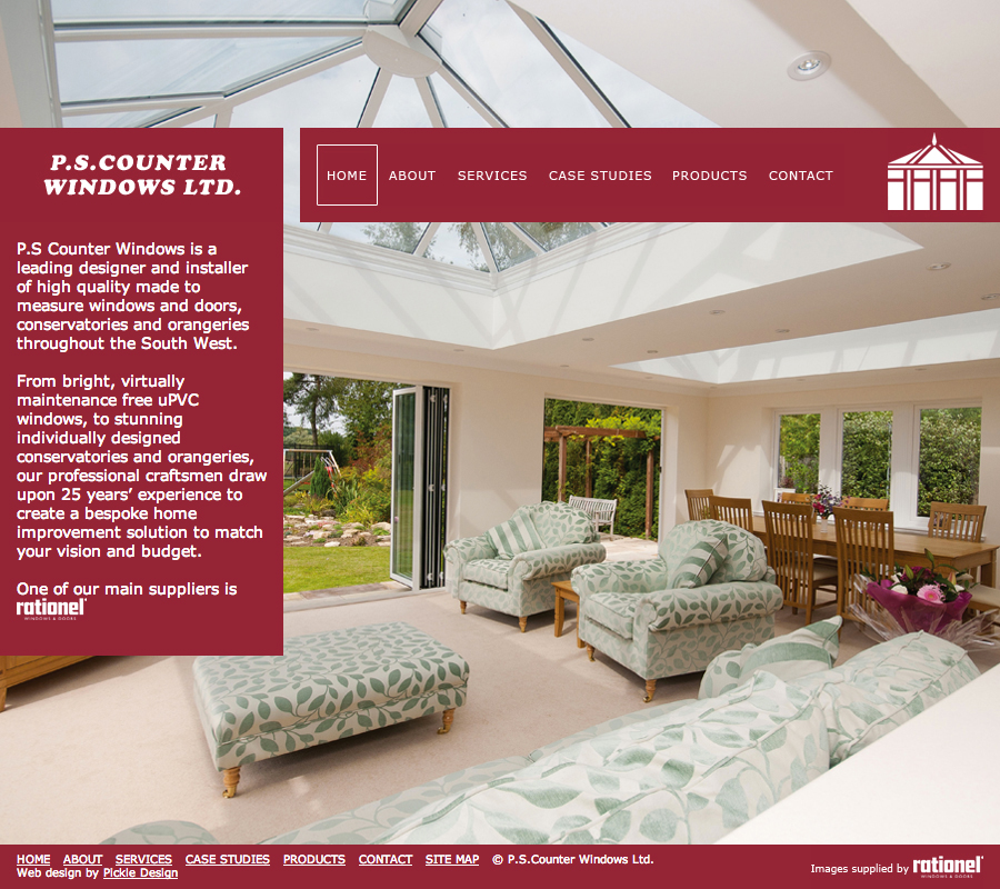
One of our recently completed websites was for local company PS Counter Windows. They wanted to have a website that would showcase the wide variety of their projects and the quality of the craftsmanship. I felt it was key to have large images, so divided the page a bit like a window, choosing an image for each that would fill the page. The intention to create a striking impact. Working with the existing brand, logo and main colour, maroon, the palette was restrained. The tool bar was designed to highlight when selected with a large box, again echoing the client's product. The website also has the facility for our client to add case studies, allowing their website to act as a portfolio. The main images here can be navigated by thumbnails or arrows. The site also has a product page, allowing visitors to see the full range of products and services on offer. The client has the ability to edit this text and upload images as their range changes. This new website moves...

Website Design for Tredore House B&B

Image
We designed a website for Cornish bed and breakfast Tredore House. The layout is simple with clean lines and large photographs. The property itself is tucked away down a country lane from the North Cornwall village of St. Issey, not far from Padstow overlooking the Camel Estuary - and is a real gem. Beautiful period features have been lovingly brought up to date with the owners' fresh contemporary style. There are 3 rooms all of good size and my role was to present the bed and breakfast in an easy to access website. First I tweaked their logo, making the illustration become more of a marque. The tree is taken from their property and is very characteristic of Cornwall, windswept and interesting! I wanted to use cool shades of blue with the grey to echo the Cornish slate from the house and lovely seaside shades of the beaches just a short drive away. I kept the navigation clear and prominent on the left as this site would be visited by all ages and people from across th...

Rebrand for Beautiful Cornish Holiday Cottages

Image
We thought we'd show you one of our projects, Rooke Cottages, a family run company that we recently completed rebranding. They have beautiful five star cottages not far from our studio. I started with the logo, using muted shades inspired by traditional paint colours and created a little motif of a leaf communicating the idyllic countryside location. I used both a contemporary and a traditional font showing the modern feel of the interiors of these old stone cottages. The beautiful old farm buildings have been completely renovated and furnished to a really high standard. Next we focussed on the website. Our client wanted to let their pictures to do the talking, so I kept the design very minimal, with the palette of greys and soft greens and plenty of white space. A large sliding image dominates the home page with a snippet from the blog and a featured cottage. Rooke have eight accommodations available, seven cottages based on their family working farm and a well a...

Branding and Web Design for Online Flower Shop

Image
We recently completed an eccommerce website for a local Cornish business, The Cornish Flower Shop. Our client already had a website and was selling her fresh flowers online but wanted to expand. We started with her logo drawing inspiration from the bright colours of the flowers she grew so we created a colour scheme of green and pink. I used some elements of illustration in the logo but it is quite simple using only one colour and is a vector image. To accompany this I also illustrated one of our clients bouquets to use as an extra element and show a combination of fresh and friendly hues. Next we moved onto the website. One of our clients unique selling points was her location, these flowers before they are pressented to you at your door have lived a charmed life! They are grown on a small scale on a Cornish farm with views to both coasts. So with this in mind I wanted to use quite a bit of photography in the site setting the scene. The home page I have designed to have ...

Bathroom Solutions Website

Image
Recently we designed a website for Wonderful Bathroom Solutions, or WBS, a company that sell bargain bathroom suits and accessories online. They approached us to create a fully e-commerce shop. The brief was for eye-catching graphics and a very easy to use shopping process. So we designed a site that is full of bright, bold and chunky design, with clear sign posting, proud about its affordability without compromise on design. The home page acts as a spring board to the rest of the site, while also drawing attention to the product of the month, the catalogue and the latest deals. The products are arranged clearly with plenty of white space and clear images to help with the shopping process. We have really limited the amount of steps needed to speed up the purchasing, so buying a bargain suit online just got easier!

Website for The Wheelhouse, on the Isles of Scilly

Image
We recently designed a new website for The Wheelhouse, a guest  house right on the beach on St Marys, one of the islands that make up the Isles of Scilly. We started the project by designing a logo and then moved onto the website. Due to the outstanding location of the guest house I wanted to communicate that oneness of the sea, so I kept my colour palette simple with beachy blues and white space. It was important to the client to have a website that was easy to navigate and be user friendly. Images were also key, so there are two image carousels on the website and Polaroid style pictures on every page which open larger when clicked on. I drew bespoke maps for each Island and custom designed a blog which is fully integrated. The site also features a webcam so everyone can experience the sea views, no matter where they are. The gallery is also totally editable by the client. Working on this site has really has tempted me to the Scilly Isles! Website design by Pick...

Apple Mac Support in Devon and Cornwall

Image
This is a website we have designed for Mactech, an Apple Mac support company servicing Devon and Cornwall. The client wanted a clear and simple presence on line. I designed a site which had an obvious affiliation with Apple but also communicated a clear Mactech brand. We used white and grey with the accent colour of red as the colour scheme. The social media buttons for Facebook and Twitter were styled to match the steely metal finish of the Mac Mini image on the home. The website is informative and details the service Mactech provide, making it very easy to get in touch. A straightforward static site that uses stock imagery and clear copy to communicate its purpose. Emma Julian