Posts

Showing posts with the label leaflet design

A Summer of Design for Wavehunters
Image
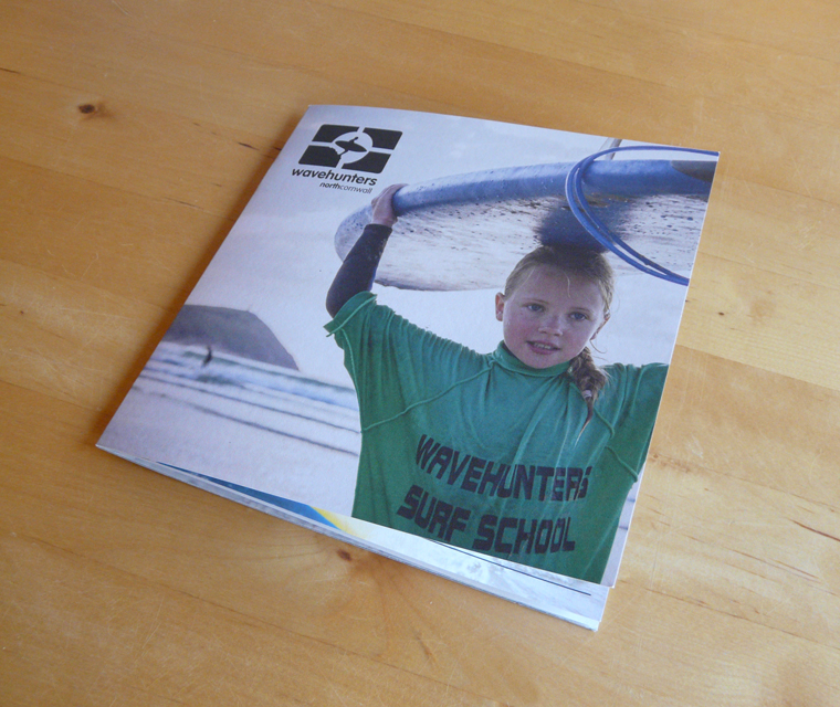
It has been a busy season for our friends at Polzeath beach, Wavehunters. We manage their design and this year they have been keeping us busy!! We shared recently about the trailer we branded for them, see here . We have also produced some brand new brochures, lovely uncoated booklets with one colour wraps showing all that the team have to offer.  This year the company has really expanded with Wavehunters Marine running boat trips out on the sea, spotting all sorts of beautiful wildlife - puffins, dolphins and seals! So the brochure we designed needed to show all the courses and lessons they offered, surfing for kids, grown ups, groups, stand up paddle boarding and of course, those boat trips. We used large characterful photographs full of colour to complement the monochrome branding. The brochures were left in key locations in Cornwall, like St. Moritz hotel where we designed a feature wall - organising the photographs, sign writing and vibe of this point of sale. ...

Brochure Design for The Wheelhouse Guest House

Image
We thought you would like to see a brochure we designed for the Wheelhouse. We posted a story about their website in 2012 which you can read here . This friendly guest house has a great location, right on Porthcressa Beach, St Mary's, on The Isles of Scilly. Previously our clients sent out a leaflet to anyone enquiring, but we wanted to create more of an upmarket brochure. We preposed larger sized pages to a standard six page DL, to allow more of a journey, meaning the central spread matched their panoramic views. We printed the brochure on uncoated stock to add texture to the feel, adding quality and really making use of the great photography of their location. There are elements of the website that we carried across, sky blues and boating navy complement the Polaroid style images. We layered the pictures - images of sea views, details of hospitality and pictures of the rooms - to create interest. Phrases from the website were brought in accompanying minimal text, making ...

Camel Ski and Snow Flyers

Image
The inside of the concertina fold Camel Snow flyer We thought we would show you some of our recent printing jobs for Camel Ski School who we have enjoyed working with for a number of years. The three DL flyers for Camel Ski School Initially they had an A4 folded to a third to promote the school, but as there is so much variety to their service chose to use three DL flyers which showcase key activities. They were distributed through the local region. The Camel Camps brochure cover The ski school, located in Rock, Cornwall, also runs camps for kids from the cities to make the most of outdoors activities and to teach them survival skills. The leaflets for the camps needed to work in a different way, they were to be sent to schools and needed to look eye-catching and dynamic. Inside pages of the Camel Camps flyer We thought the best format for this was a concertina fold leaflet. Each panel could then highlight a different aspect of what the team do and allow image...

New Lifestyle Magazine for the South West

Image
We are currently working with a client on a new magazine, The Southwest Magazine. It is a very exciting project that meant starting from scratch to create a brand and the look for the magazine. The new magazine will be funded by advertisers but free to consumers and will represent the whole of the South West, showcasing all that the region has to offer and tempting potential tourists. We started by creating the brand. I designed several options taking into account the brand's application across many variables. The logo that was chosen is contemporary and clean with the accent colour of bright cyan to suggest sea or sky. I also created a few variations on the logo to suit all its different applications. With the logo agreed the next stage was to produce a flyer to promote the magazine and to give an indication of the style. We designed a DL flyer working with stock images to introduce the new magazine as 'a different perspective'. Then the brand was applied ...

Wavehunters Surf School Leaflet

Image
Andy from Wavehunters approached us in the Spring of 2011 to create a leaflet promoting their surf school. We designed and printed an A4 folded to DL leaflet packed full of their great images, explaining about the service. We have worked for Wavehunters before, using their existing brand to create letterheads, complement slips and business cards. As the focus this time was to be on the surf school, we utilised their photographs and set out to communicate the atmosphere down on the beach. The inside page brakes down the many different activities they offer and showcases the latest craze, stand up paddle boarding. The look is both laid back, Cornish and packed full of possibilities. The leaflets have been well received and you may well see them, hopefully, everywhere!

Final Touches to New Business' Brand

Image
You may remember we recently wrote about some business cards we have created for new business, Camel Self-Storage, well, we just completed their stationery and leaflet design. Being a new company the clients had a lot they wanted to communicate, wanting to show the full extent of their potential. So with the DL leaflet we chose stock imagery that would visually point the viewer to all the different services they offer. The back of the leaflet was used to help explain the process and to show the location. I stuck clearly to the defined brand colours, and feel we created an eye catching design. I have also been working on some advertising for the company, so watch out for that in local publications. With their stationery, the clients wanted to keep the information's presentation traditional. I had presented them with some more contemporary options, but the simplicity of the designs included in this post worked better for their target market. I am pleased with the final resul...

Construction Firm Flyers

Image
It was enjoyable to recently revisit a brand we created a few years ago. J.Murray Homes is a construction firm located in Somerset who have a keen sense of design in their work and presentation to the public. Emma Julian designed the logo as one of her first branding exercises after joining Pickle Design. This was our first opportunity to design and print manage advertising information for them. They chose to stick to their brand colours and use strong images from their portfolio. Their service stretches from smaller jobs to imaginative renovations. The fireplace pictured is a project the are very proud of, showing off their interior design skills as well. The print options they selected was a satin finish printed full colour on 300gsm stock. Durable and professional, able to stand being posted and displayed for extended periods of time.

P and P Groundworks Leaflet

Image
We recently finished designing and arranging the print of the leaflets pictured above for Penni and Paul of P&P Groundworks. The leaflets were part of a project that included website and stationery design. Penni and Paul would both admit that photographs of their work are difficult to make exciting, as they specialise in creating foundations with pin point accuracy. But they also create patios, an aspect of the business that is growing. They pride themselves in handling everything on the site that is required, taking all the work off the shoulders of the owner. They talk through the whole process, and make sure that the site is emmaculate once finished.

Rooke Cottages Leaflets

Image
DL flyers seem to be becoming a speciality of ours; a lot of our clients have requested one after seeing some of our previous work, and this is one we are proud of. A new leaflet for Rooke Cottages, based just outside Chapel Amble near Wadebridge. Designed to be displayed in leaflet dispensers and show off how luxurious the accommodation is, we matched their existing brand and let the images do the talking. The print really finishes off the job. A heavy, environmentally friendly card was selected, printed uncoated to add texture to the flyer's feel. These self catering cottages in North Cornwall are five star gems, and have to be seen for themselves.

Minear Engineering Leaflet

Image
Here is the completed 6pp DL (A4) leaflet we have just completed for Minear Engineering. They are a well established firm based at Victoria Business Park, just off what was the A30. They have worked with the China Clay industry for decades, creating bespoke pieces of machinery and metal work, and now are expanding in the food industry, where there is always a need for engineered stainless steel. Marie designed the leaflet, taking her palette from the existing company colour scheme, aiming to give it a industrial feel through the use of blue as a signature theme. Minear Engineering were looking to convey their professional service, and we focused on presenting their business in a contemporary setting.