Less is More: A Look Back at Plakatstil
Lucian Bernhard "Priester" matches poster (1906) - View original image
We often talk about minimalism in modern web design—stripping away the clutter to focus on the user’s primary need. But as with most things in our industry, this isn’t a new idea. I was reading an excellent article on DailyArt Magazine recently about Plakatstil (literally "Poster Style"), and it struck me how relevant these century-old principles still are.
Originating in Germany in the early 1900s, Plakatstil was a reaction against the complex, swirling patterns of Art Nouveau. It was initiated almost by accident in 1906 by Lucian Bernhard. The story goes that he entered a poster competition for Priester matches and, trusting his instincts, simply painted two matches and the brand name on a flat black background. It was bold, direct, and completely rejected the ornamental fuss of the time.
Hans Rudi Erdt's "Opel" poster (1911) - View original image
The key features of Plakatstil—flat colour, a simple central image, and bold lettering—are essentially the great-grandparents of the flat design trend we’ve seen dominate UI and branding for the last decade. Artists like Hans Rudi Erdt and Julius Gipkens understood that you don't need to shout with detail to be heard; you just need to be clear.
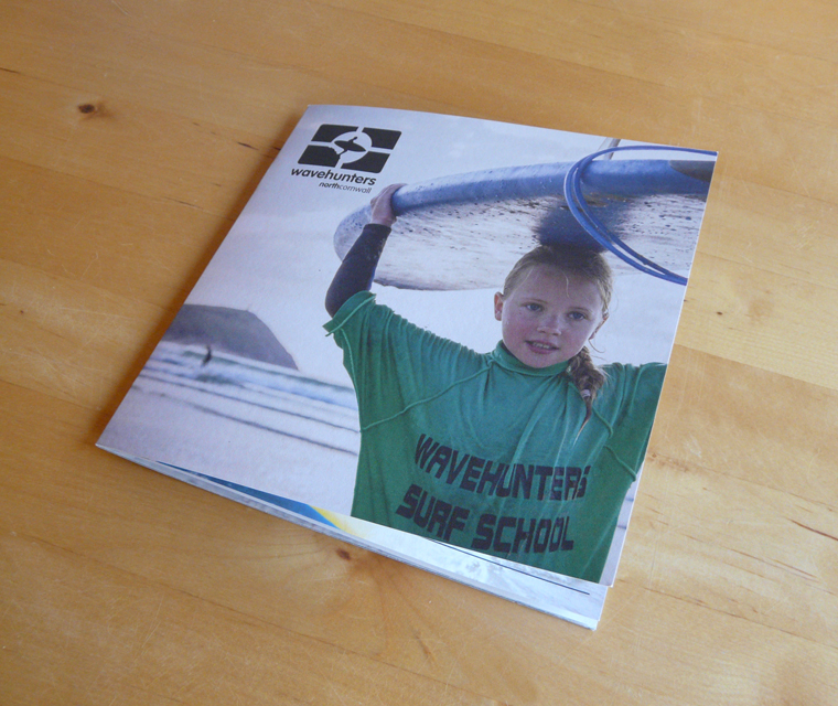
As a studio, when we approach a new logo or a website layout, we try to apply this same discipline. Does that extra element add value? If not, cut it. Bernhard’s philosophy was that you see with your eyes, not your brain. That immediate visual impact is what we strive for, whether it’s a brochure for a Cornish garden or a digital campaign for a local charity.
It is worth remembering that "simple" is often the hardest thing to get right.
You can read the full history of the movement on DailyArt Magazine.


Comments
Post a Comment