Posts

Showing posts from 2013

2014 Calendar Celebrating Classic Chair Designs

Image
We are very proud to unveil our 2014 calendar, an A2 poster celebrating great chair design. Every year we like to design a calendar for our clients - nothing standard of course - but a chance to show off the Pickle Design style, and hopefully create something our clients want to keep. There are always challenges we have to face, but it is quite fun trying to find a cost effective way to produce them, that doesn’t loose impact. Our 2014 calendar uses just two colours, red and blue, but layers them in opacities to create bold representations of iconic chair designs. The typography is clean and simple with a retro bent. Usually I draw my illustrations by hand and then scan them in, but for this particular project I had a very clear style in my mind, so I used Adobe Illustrator. I looked at these pieces of furniture as shapes, and made them up in shades and segments to build, hopefully, striking representations. The calendars are available from the Pickle Design website here ,

Branding, Print and Website Design for BeauPeople

Image
I wanted to share a recent brand we completed, BeauPeople. Our client approached as at the very start of her new business in workforce development. She needed a corporate and professional identity which showed she meant business, but still reflected her bubbly personality and approachability. We designed a logo in warm autumn hues with harmonising imagery. One of our client's great assets is her ability to bring unity and conflict resolution to the work place, so we looked at ideas of building bridges, Japanese design and elements of balance. The final logo communicates the harmony our client can bring to a situation, the 'beau' and 'people' acting also like a reflection. When it came to designing the business card I continued to use the two colours of her brand, and bold clear placement of the logo. I felt that some explanation was needed, so a friendly speech bubble helps to communicate the personal side of the service. Next we concentrated on

Camel Ski and Snow Flyers

Image
The inside of the concertina fold Camel Snow flyer We thought we would show you some of our recent printing jobs for Camel Ski School who we have enjoyed working with for a number of years. The three DL flyers for Camel Ski School Initially they had an A4 folded to a third to promote the school, but as there is so much variety to their service chose to use three DL flyers which showcase key activities. They were distributed through the local region. The Camel Camps brochure cover The ski school, located in Rock, Cornwall, also runs camps for kids from the cities to make the most of outdoors activities and to teach them survival skills. The leaflets for the camps needed to work in a different way, they were to be sent to schools and needed to look eye-catching and dynamic. Inside pages of the Camel Camps flyer We thought the best format for this was a concertina fold leaflet. Each panel could then highlight a different aspect of what the team do and allow image

The Glasshouse Website

Image
One of our clients, the Glasshouse restaurant in Wadebridge, wanted to refresh their website design recently. We had designed their logo and site many years ago and it was time to breath fresh life into their online presence. This time I wanted the colours of the website to reflect the atmosphere of the visually distinctive restaurant - windows make up three walls, broken up by fabric in bold colours - so brought in vibrant stripes of bright oranges, reds and maroons. The design was kept grounded by using white space an an accent of the grey. This is a simple website of five pages with its prime focus to capture the laid back atmosphere of the restaurant. I took some photographs to set the scene and to give an idea of the style of food, also taking inspiration from the angles of the logo and carrying this through the design.

New Website for Cornish Garden Team

Image
Take a look at our brand new website for The Cornish Garden Team. With this website I wanted to communicate the full extent of service on offer, from the maintenance of huge gardens to creating smaller ones and landscaping some really quite special spaces. We felt the best way to do this would be through images, so designed the website to have a large picture on each page. The home has a fading slideshow that shows each aspect of their service, and when clicked on, you are taken through to the relevant page. I used soft silvered greens for the main background of the site with accents of a darker forest green and a cherry red. Designing anything to do with nature is always a joy - such a wealth of visual language to draw from. The website also has a case study gallery which the client is able update themselves. As their portfolio really is the best promotion of their service, I made this eye catching and easy to use, while aiming to keep the layout quite restrained to allow

A Weeks Work Experience at Pickle Design

Image
Last week we enjoyed having Jess Fisher in the studio for her work experience, she wrote a little about her time with us: Monday and Tuesday: On Monday I was given the task to create some packaging for a brand of Shea Butter. First of all I had to research Shea butter on the internet. I found how it was made, what it is made from and where it is made. Using this research, I then had to design my logo. We decided to call the brand 'Shea beauty' as this was the name of an already existing product for Pickle Design.  I then made my logo using two different font styles, a fun, informal one and a clean, white font. I felt they went well together and I chose the duck egg blue colour as I felt it contrasted well with the white. I chose the pale brown colour because it was very similar to the colour of the Shea butter. I then decided to add an illustration of the nuts used to create the product. I chose these because I felt they represented to brand well. I then had t

New Website for Ego Menswear in Wadebridge

Image
Ego, an independent designer menswear shop in Wadebridge, Cornwall needed a web presence. The proprietor approached us with the main aim of the site, to encourage people to visit his shop. His shop has an interesting range of designer labels and the brief was to communicate this. As the website is not e-commerce, I used photographs of the interior mixed with the lifestyle shots from the brands. The company had a brand in existence so I kept to its parameters, using the colours of black and grey, and added an accent of red to keep the site bright with plenty of white space. On each page there is a banner image and on the category pages took each brand, and using the iconic logos alongside a key image, put together Polaroid style blocks. The intention to communicate the full range available. On the Contact page I used the opportunity to link the shop to other notable locations in the town, as the site needed to appeal to locals and as well as vistors to the regio

New Website for PS Counter Windows

Image
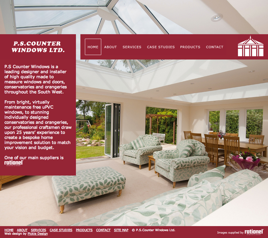
One of our recently completed websites was for local company PS Counter Windows. They wanted to have a website that would showcase the wide variety of their projects and the quality of the craftsmanship. I felt it was key to have large images, so divided the page a bit like a window, choosing an image for each that would fill the page. The intention to create a striking impact. Working with the existing brand, logo and main colour, maroon, the palette was restrained. The tool bar was designed to highlight when selected with a large box, again echoing the client's product. The website also has the facility for our client to add case studies, allowing their website to act as a portfolio. The main images here can be navigated by thumbnails or arrows. The site also has a product page, allowing visitors to see the full range of products and services on offer. The client has the ability to edit this text and upload images as their range changes. This new website moves

Website Design for Tredore House B&B

Image
We designed a website for Cornish bed and breakfast Tredore House. The layout is simple with clean lines and large photographs. The property itself is tucked away down a country lane from the North Cornwall village of St. Issey, not far from Padstow overlooking the Camel Estuary - and is a real gem. Beautiful period features have been lovingly brought up to date with the owners' fresh contemporary style. There are 3 rooms all of good size and my role was to present the bed and breakfast in an easy to access website. First I tweaked their logo, making the illustration become more of a marque. The tree is taken from their property and is very characteristic of Cornwall, windswept and interesting! I wanted to use cool shades of blue with the grey to echo the Cornish slate from the house and lovely seaside shades of the beaches just a short drive away. I kept the navigation clear and prominent on the left as this site would be visited by all ages and people from across th

Rebrand for Beautiful Cornish Holiday Cottages

Image
We thought we'd show you one of our projects, Rooke Cottages, a family run company that we recently completed rebranding. They have beautiful five star cottages not far from our studio. I started with the logo, using muted shades inspired by traditional paint colours and created a little motif of a leaf communicating the idyllic countryside location. I used both a contemporary and a traditional font showing the modern feel of the interiors of these old stone cottages. The beautiful old farm buildings have been completely renovated and furnished to a really high standard. Next we focussed on the website. Our client wanted to let their pictures to do the talking, so I kept the design very minimal, with the palette of greys and soft greens and plenty of white space. A large sliding image dominates the home page with a snippet from the blog and a featured cottage. Rooke have eight accommodations available, seven cottages based on their family working farm and a well a

Wonderful Food at The Dining Room Restaurant

Image
Recently Carl treated me and his wife Maria to a meal at The Dining Room; the restaurant of one of our client's. The Dining Room is a cosy fine dining experience in Rock, North Cornwall - and the food was delicious! A feast for the eyes as well as taste buds, with homemade bread and homemade fresh clotted cream butter, light delicate soups, terrines, glazed belly pork and venison all tasted. Puddings of custard tart and dark chocolate ganache with home made hazelnut ice cream. Topped off with the most delightful mini cake stand with a Cornish cream tea. It kept our mouths watering for days after and looking at the pictures brings back those wonderful tastes all over again! Any day now the website we designed for them will go live, and you can see even more of Fred and Donna's culinary delights. Emma Julian

Branding and Web Design for Online Flower Shop

Image
We recently completed an eccommerce website for a local Cornish business, The Cornish Flower Shop. Our client already had a website and was selling her fresh flowers online but wanted to expand. We started with her logo drawing inspiration from the bright colours of the flowers she grew so we created a colour scheme of green and pink. I used some elements of illustration in the logo but it is quite simple using only one colour and is a vector image. To accompany this I also illustrated one of our clients bouquets to use as an extra element and show a combination of fresh and friendly hues. Next we moved onto the website. One of our clients unique selling points was her location, these flowers before they are pressented to you at your door have lived a charmed life! They are grown on a small scale on a Cornish farm with views to both coasts. So with this in mind I wanted to use quite a bit of photography in the site setting the scene. The home page I have designed to have