Posts

Wavehunters Surf School Leaflet

Image
Andy from Wavehunters approached us in the Spring of 2011 to create a leaflet promoting their surf school. We designed and printed an A4 folded to DL leaflet packed full of their great images, explaining about the service. We have worked for Wavehunters before, using their existing brand to create letterheads, complement slips and business cards. As the focus this time was to be on the surf school, we utilised their photographs and set out to communicate the atmosphere down on the beach. The inside page brakes down the many different activities they offer and showcases the latest craze, stand up paddle boarding. The look is both laid back, Cornish and packed full of possibilities. The leaflets have been well received and you may well see them, hopefully, everywhere!

The New Pickle Baby!

Image
A good way to end the year at Pickle Design with a new addition! Rufus was born at 5.09am on the 23rd of December and is now at home with his mum and big brother Henry! Carl and Maria would like to say thank you to everyone who wished us well on the nervous week before he was born, and also to all who have been in touch since.

Picaloulou's Hand-Knitted British Children's Clothing

Image
We have just completed a very exciting project for brand new company, Picaloulou, a web-based business selling beautiful hand-knitted woollen clothes for children. These are the highest quality and completely British. Our task was to design a website that would communicate the integrity and beauty of the brand, and feature an easy to use online shop. We worked on the look allowing plenty of white space for the stunning photographs, with a colour scheme of muted greys. The brightness comes from the woollen garments themselves and the vibrant logo. The home page has fading images using handwriting to create an informal feel. There are also feature boxes that connect straight through to key pages. The Facebook and Twitter logos have been custom designed, in-keeping with the rest of the site, and we have used little elements of illustration to bring a child-like feel. As well as designing the pages for the shop, all restrained and clear, we have created the concept for the b...

Cafe Menus Full of Illustration

Image
We have just completed new menus for the Wadebridge coffee shop, Caraways. They approached us to re-design their menus to reflect the feel of their friendly cafe. We kept within their colour scheme of coffee browns, caramels and creams, but added a dusky sky blue. I chose a friendly serif font and filled the pages with my drawings of coffee cups and cakes, sandwiches and salad. The menu took the format of A5 folded with a durable matt finish. The front page has an illustration of a large cup of steaming hot coffee, with a dotty frame surrounded by a crisp white background. Inside the format has titles, descriptions and prices separated by dotted lines and distinguished by colour and weight. The menu is such an important part of a cafe and we are pleased that Caraways now has something representing them in a fun and relaxed manner.

Granny Wobbly's Fudge Pantry Website

Image
Recently we completed an e-commerce website for Granny Wobbly's fudge. They already run two cute and quirky fudge shops in Wadebridge and Tintagel, Cornwall, but wanted to expand their shop online. The clients already had a logo and we needed to convey the feel of the shops themselves on the website. So we designed a simple but fun website, complete with blog and full e-commerce facilities. We used pink dotty and stripy bunting to frame the site and a swirly background allowing the text to be clear on a white page. The blog appears on the right hand side of the home page like a blackboard and there is a section for the client to update with their seasonal promotions. The shop admin allows the clients to upload the products themselves and edit the categories, and the shopping cart was designed to fit into the website style. The intention is for the shop to be very easy to use, encouraging sales. One of the best things about the project was tasting their ever changing var...

The Artist, Joanna Commings', Online Gallery

Image
We have recently completed a website for talented Cornish-based artist, Joanna Commings. She approached us as she needed an online presence and a way to showcase her portfolio. I love designing artist's websites, as the idea is to make the design minimal and allow their work to speak for itself. I chose one of her iconic paintings as a banner and used the navigation to create depth, light and shade. Then created a format allowing a large image and thumbnail shot on each page, with a pallet of grays and white to complement Joanna's Cornish art. The home page has an editable section where Joanna can keep people informed about up and coming exhibitions, along with a little information about the artist herself. There is a page focussed on her landscape paintings and a page about her portraits and commissions. We also created an online gallery so that Joanna could upload her paintings herself. This allows her beautiful pictures to be displayed large and to be navigated w...

New Website for Lola Smith's Handmade Children’s Clothing

Image
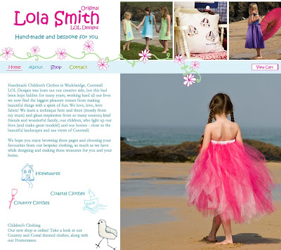
We would like to introduce you to Lola Smith, a very unique business. This is the new website we have designed, complete with an e-commerce shop for Lola Smith's handmade and bespoke clothing. Lola Smith creates clothes and homewares to your exact requirements, so we set about creating a website that reflected their original handmade styles and girly aesthetic. We used illustration and fading images to make the most of their lovely photography. We set the site on a background of pale blue and white dots and used little illustrations for navigation buttons, such as the social media sites Facebook and Twitter. Lola Smith's handmade children’s clothing is available from their website, but uniquely, each item is made to order. This means that the clothes are to your child's measurements, and gives you the opportunity to have something created to your tastes. The whole website uses pastel and girly colours, but we left the body of the page white to best showcase their ...