Posts

Less is More: A Look Back at Plakatstil

Image
Lucian Bernhard "Priester" matches poster (1906) - View original image We often talk about minimalism in modern web design—stripping away the clutter to focus on the user’s primary need. But as with most things in our industry, this isn’t a new idea. I was reading an excellent article on DailyArt Magazine recently about Plakatstil (literally "Poster Style"), and it struck me how relevant these century-old principles still are. Originating in Germany in the early 1900s, Plakatstil was a reaction against the complex, swirling patterns of Art Nouveau. It was initiated almost by accident in 1906 by Lucian Bernhard. The story goes that he entered a poster competition for Priester matches and, trusting his instincts, simply painted two matches and the brand name on a flat black background. It was bold, direct, and completely rejected the ornamental fuss of the time. Hans Rudi Erdt's "Opel" poster (1911) - View original image The key features of Plakatstil—fl...

Inspiration: Masanobu Hiraoka & Max Cooper's 'On Being'

Image
We often look to different mediums for inspiration here at the studio, and a recent collaboration between London-based musician Max Cooper and Tokyo director Masanobu Hiraoka has caught our attention. Their project, On Being, is a masterclass in translating complex data into a fluid visual narrative. Cooper started the project by asking the public a simple question: “What do you want to express that you feel you can't in everyday life?” The resulting database of anonymous answers—ranging from the mundane to the profound—formed the basis for the album. For the title track’s video, Hiraoka took this concept of shared humanity and interpreted it through a distinct animation style. He uses rotoscoping and frame-by-frame pencil drawings to create a continuous flow. The visuals morph seamlessly from personal footage of the animator’s own child into microscopic biological structures. It is fascinating to see how a single line is used to connect these disparate elements, maintaining moment...

The Mid-Century Design Playground: When Icons Made Books for Kids

Image
Henri's Walk to Paris Hardcover by Saul Bass   Vintage Kids' Books My Kids Love I've been completely captivated by a recent article from AIGA's   Eye on Design   titled, "Why did so many mid-century designers make children's books?". It explores a fascinating and somewhat unexpected corner of design history: the period when some of the most influential graphic designers of the 20th century turned their talents to creating books for children. We're talking about legends like Paul Rand , Saul Bass, Ivan Chermayeff , and Leo Lionni – names synonymous with corporate identities, film title sequences, and modern art. So, why the pivot to picture books? The article delves into several compelling reasons. One key factor was the post-war baby boom, which created a massive market for children's literature. Simultaneously, advancements in printing technology made it possible to produce high-quality, colorful books more affordably. But beyond market forces, ...

A Life Among Letters: The Quiet Work of Clara Istlerová

Image
It’s not often that a project comes along that feels both new and timeless, but a recent publication featured on  It’s Nice That  seems to strike that balance.  A Life Among Letters  is a book that delves into the work of Czech graphic designer and typographer Clara Istlerová, a pioneering figure whose contribution to the visual culture of postwar Czechoslovakia is significant, yet not widely known outside of her home country. What makes this project so interesting is its quiet, considered approach. In an age of self-promotion, Istlerová’s story is one of dedication to the craft itself. Working entirely with analogue processes, she was one of the few women in the male-dominated field of Czech typography. Her book covers and typographic work show an expressive and intuitive feel for letterforms, a tangible quality that can sometimes be lost in the digital age. If you grew up in Czechoslovakia, the article notes, you have probably held one of her designs without knowin...

Design Musings

It’s about time I revisited this blog…we moved the new posts across to a blog built on our website, which makes a lot of sense, but has left this blog feeling like an abandoned Wild West town! What to do with it then? How about some interesting design related finds from around the world? New design posts will follow soon!

A Goodbye To 2015

Image
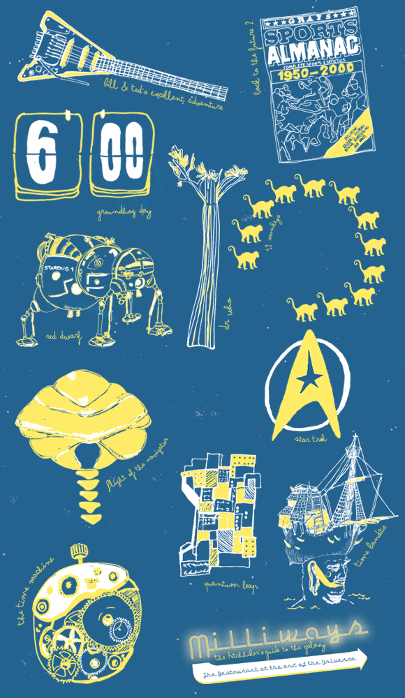
What a busy year! 2015 has been a blur in the studio with a real variety of exciting projects. With our own work we have been focussed on the 2016 calendar - something a little different! We are posting them out now to our clients and soon you will be able to buy one on our website. We brought you our pick of Design Classics - actually quite a tricky brief! There is so much good design out there, we selected those items that stood the test of time and are still being referenced in design today. If you sign up to our newsletter you can see which piece we feature each month. Here a few of our favourites from this year... Our 2015 calendar was all about time travel! For December we conclude with The Time Machine, H.G. Wells' marvellous creation. A book that has inspired countless future generations with stories that dart through time. Our idea came from the well loved movie Back to the Future Two, where Marty McFly travelled to the future (and the past)  to right some wr...

Design for Nick the Pro

Image
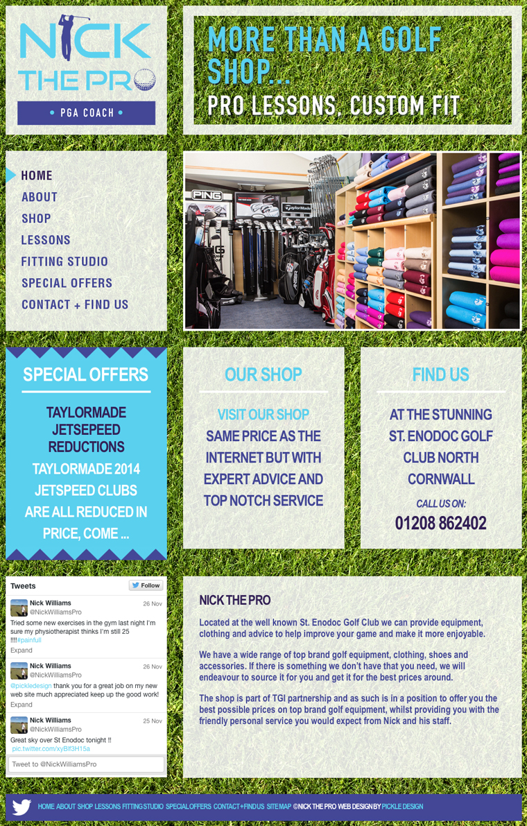
Quite often the websites I design are minimal, controlled and use white space rather lavishly. However sometimes a project calls for something a little more bold. When I was designing this website for Nick The Pro, I decided to go for bright. Nick has the golf shop at the beautifully located St Enodoc golf course in Cornwall. We started by designing Nick a logo and then some stationery and finally this website. Nick stocks the best gear for golf but at really competitive prices. He also offers pro lessons and a great fitting service - quite a lot to communicate in a design! I wanted this website to grab your attention from the outset so I went for a vibrant green background, the monitor is filled with grass and then I used chunky boxes to display the content which scrolls while the background is fixed. We have an image animation and feature boxes showing the latest special offers on the Home page. The site also has a Twitter feed and a custom designed map showing their location...

A Summer of Design for Wavehunters

Image
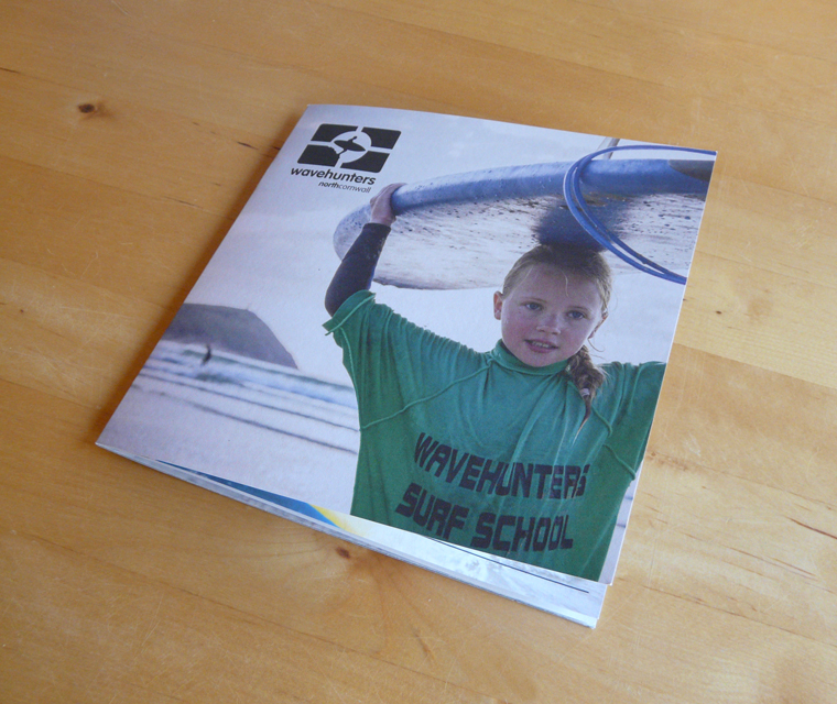
It has been a busy season for our friends at Polzeath beach, Wavehunters. We manage their design and this year they have been keeping us busy!! We shared recently about the trailer we branded for them, see here . We have also produced some brand new brochures, lovely uncoated booklets with one colour wraps showing all that the team have to offer.  This year the company has really expanded with Wavehunters Marine running boat trips out on the sea, spotting all sorts of beautiful wildlife - puffins, dolphins and seals! So the brochure we designed needed to show all the courses and lessons they offered, surfing for kids, grown ups, groups, stand up paddle boarding and of course, those boat trips. We used large characterful photographs full of colour to complement the monochrome branding. The brochures were left in key locations in Cornwall, like St. Moritz hotel where we designed a feature wall - organising the photographs, sign writing and vibe of this point of sale. ...

NPW Bespoke

Image
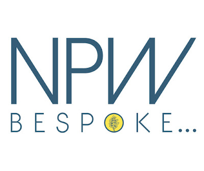
Some stationery to show you! The work in our studio is very diverse, I think that is because of all the wonderfully interesting companies we work with in Cornwall. Large or small I really enjoy meeting new clients and sussing out what they need.  Recently we met with bespoke carpenter, Nick Paul Williams, who had a refreshingly creative approach to his joinery. We are building him a website as we speak, but first we started with the brand. He already had an emblem of an oak leaf and was keen on keeping the colours of gold and blue. Our challenge was to move this logo on to become a brand that rightly represented this young craftsman.  Reducing his name to NPW and including 'bespoke' helped to communicate the personal aspect of Nick's work. Also to make clear that he can turn his hand to all aspects of joinery we picked out three key elements; carpentry, joinery and construction.  We also provided Nick with a separate element that he could use as a stamp o...

Tom's Time at Work Experience

Image
Hi, my name is Tom and here is what I did in my week of work experience at pickle design. Emma and Carl made me feel welcome. I had never used a Mac before so it took some getting use to but now I can use the Mac with ease.  The programmes I used were InDesign, Illustrator and Photoshop all made by the company Adobe.  My first project was to create a business name and logo for an electronics company trying to sell headphones and during this project I made the front page of a web-page for it. Then I adapted a website into a mobile friendly format, The Quarryman pub. My second project was to make a double sided A5 leaflet for Comic Con using Indesign and Illustrator, during this I made a mood board to inspire me. My third project was to create packaging for fudge I did this by using Illustrator and Photoshop, I made another mood board of fudge related objects. My last project was to create a fold-out leaflet for Camel Self-Storage I added infor...

Branding for Samphire

Image
A new and exciting project for us is Samphire, a luxury chef prepared food service delivered to your door frozen or chilled. Serving the Rock, North Cornwall area this great brand is perfect for lazy evenings in, special occasions or holiday makers.  Our clients approached us with a clear vision, the name Samphire refers to the delicious plants grown by the sea, really good for you and really yummy. I used the fresh green and the paired it with black for a seal-like logo that speaks of quality and has a hand made, artisan aesthetic. We then carried this hand made feel through to the website using textures and illustration to further communicate the delicious chef prepared food. The website features a blog incorporated on the Home page where the posts alternate and show the latest from the kitchen.

Trail Bike Hire Website Redesign

Image
We have had some great websites come into being recently - and we thought we would show you one of our latest, Trail Bike Hire. If you live in or have visited North Cornwall then no doubt you have heard of the Camel Trail. When I holidayed in Wadebridge as a child I was convinced that camels were involved, but sadly no, the camel reference is to the River and not to a Moroccan caravan. The trail itself takes the route of an old railway track and runs through some very scenic landscape. The route is mainly flat and travels through Padstow, Wadebridge, Bodmin and Wenfordbridge. Trail Bike Hire supply bikes from their Padstow base for the Camel Trail. Our brief was to create an informative and easy to use website. I wanted the design to be fresh and modern and to capitalise on the current trend for everything bike. Some elements from their existing brand were also used, such as the lovely Gill Sans font (featured in June’s Design Classic: Penguin Books ) which evokes the railway c...

Wavehunters Trailer at Polzeath

Image
It is busy busy in the studio at the moment! Some great work coming our way. One of our oldest clients is Wavehunters, who run a surf school at Polzeath. We have been producing their leaflets and brochures and they wanted to up their profile as they had expanded to now include Wavehunters Marine, trips out on their 9m RIB powered by 2 x 175 hp engines. They offer Sea Safaris, water taxi and private charter from Rock. So to improve their presence on the North Cornish coast we created vehicle graphics for a trailer they have on Polzeath beach. The trailer offered a great variety of advertising for the brand, we needed to showcase the surf school and boat trips making sure people knew all their water sports. On the front of the trailer we set up three areas to be painted with blackboard paint where the latest dolphin sightings together with surf conditions could be written. We have also created a photo-wall where people can take selfies to promote on social media that association w...

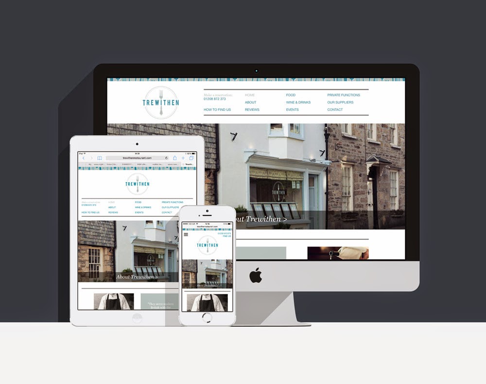
New website for Trewithen Restaurant

Image
This is one of our latest websites to go live and it is for a truly delicious restaurant in Lostwithiel, Cornwall,  Trewithen . We started with the brand, creating a logo, and some elements of illustration, menu backs, business cards and bill holders. Then we came to the website. Trewithen is the perfect balance of first class food with a friendly and personal service. The brand and website needed to reflect their quality, but also the approachable nature of the restaurant. To add to the brand, I drew a selection of forks showing the range of their fine dining, and we settled on a colour palette of silver grey and teal blue. The brand also picks up on the circle shape of a plate which we used throughout.  With the brand in place the next stage was the website. This site is responsive so it will change to fit the format of the device it is viewed on, be that monitor, tablet or mobile. The website is beautiful designed to show off the lovely photog...