A Weeks Work Experience at Pickle Design

Last week we enjoyed having Jess Fisher in the studio for her work experience, she wrote a little about her time with us:
Monday and Tuesday: On Monday I was given the task to create some packaging for a brand of Shea Butter. First of all I had to research Shea butter on the internet. I found how it was made, what it is made from and where it is made. Using this research, I then had to design my logo. We decided to call the brand 'Shea beauty' as this was the name of an already existing product for Pickle Design. I then made my logo using two different font styles, a fun, informal one and a clean, white font. I felt they went well together and I chose the duck egg blue colour as I felt it contrasted well with the white. I chose the pale brown colour because it was very similar to the colour of the Shea butter. I then decided to add an illustration of the nuts used to create the product. I chose these because I felt they represented to brand well.

I then had to create the packaging for three products, a pot of lip balm, a stick of lip balm and a box for a bar of soap. I started with the pot, which I created a label for the lid, and one to wrap around to glass jar. I stuck with the same colour scheme and logo and just added in the list of ingredients and a small section of information about how the product is made.

I then created the label for the stick of lip balm. Again this was just a wrap around and I used the same logo and colour scheme as the other products. I also included the same information that was on the pot of lip balm and used a dotted line around the edge to keep it looking interesting.
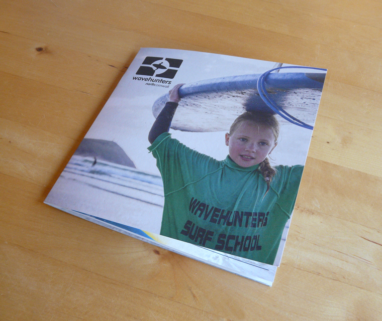
Finally I created a box for a bar of soap (image at start of post). Firstly I had to measure the soap and make a net that would fit the product well. Once I had made the net, I then again added the logo, colour scheme and all of the information used from the other products created.

This was then my finished group of branded Shea butter products.
Wednesday: On Wednesday I had the task of creating a double page spread for The South West Magazine. I was given a template of the pages but was free to choose the products, wording and layout of the entire double pages. I started by selecting an area I wanted to write about, I decided to research and write about beauty in Cornwall, including products made, spas and beauty salons. I selected 10 beauty related things in Cornwall and found pictures and text to represent them all. I then had to lay out my magazine pages, this was a lot harder than it looked! I decided to lay my top 10 in columns and have the images inserted within the text, this was to make the page look more interesting.

This was my finished double page spread.
Thursday and Friday: My task for Thursday and Friday was to create some packaging and a website for a fudge brand. These are not finished yet, but when the actual project for Pickle Design goes live, they will post the pictures of my work!
Also for Friday, I have been given the task of writing several blog posts!
Jessica Fisher

Comments
Post a Comment